
4 Common UX Mistakes to Avoid
Mar 29, 2022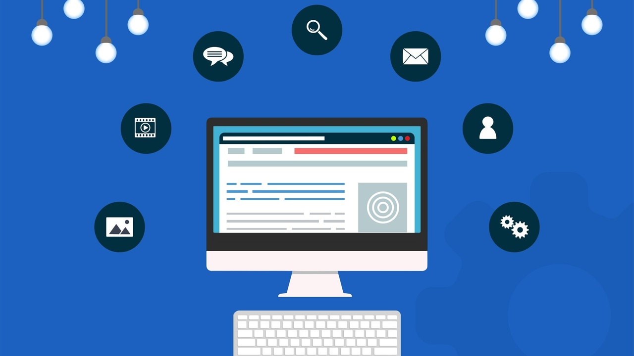
Your website is your busiest salesman. But what do you do if that salesman is confusing, makes people wait, and makes the wrong first impression? You give him the boot (and redesign him).
Here are the four most common mistakes small and medium-sized businesses make when it comes to user experience (UX).
1. They Use Sticky Headers That Are Too Large
We all like headers. Hey, we're a fan of them ourselves. But what happens when your header is too large?
It creates the wrong first impression, that's what! Why? Because we live in a distracted age of information overload, and tall headers can take away quick knowledge people seek.
Here are a few problems with large sticky headers:
- Limited copy to answer a client or customer's problem in one glance
- They don't always translate to mobile, which 56% of all users use for internet searches
- They can slow down upload times which leads to higher bounce rates
- Can make the site tricky to navigate
Your most noteworthy sales can't have flaws in their design. Consider doing away with sticky tall headers over 130 pixels to get the best design for your business.
2. They Use Thin, Light Fonts
Many small and medium-sized businesses love to use thin, light-coloured fonts. While these may seem like a cool style choice, are they functional?
Light-coloured fonts tend to get lost in the background. Considering that some customers are older and require reading glasses to see your site anyway, you're losing a lot of business.
Not only that, when you apply that same problem to a mobile phone, that's double trouble! Stay away from light-coloured fonts if you can help it, or opt for a dark background if you need to use a light-coloured font.
3. They Ignore Responsive Design
Many small and medium-sized businesses forget all about responsive design. They take the time to create their own sleek website using their computer, then forget what it might look like to the mobile user. That is a big no-no.
Creating a design that looks good only on a computer is like throwing half your customers out your door. Sounds crazy, right?
Mobile makes up more than half the market of all online consumers. That means not having a site that looks appealing on desktops, tablets and smartphones loses business.
4. Forgetting About Content
Despite what you may think, content is still king when it comes to building leads, engaging your audience, and providing value. It's important to have a variety of content for your target audience to consume, such as:
- Blog posts
- Video content
- Infographics
- Social Media
Without proper content on your website, it's like sending your best salesmen to Antarctica. They may be one hell of a salesman, but how are they adding value to your customer?
Short answer: they aren't.
Take time to create a content strategy, and develop various content to reach all of your audience. Some people like video, while others like to read their content. Don't leave anything out.
It will enhance your sales funnel, which will help drive in more leads and conversions.
Wave Bye-Bye to UX Mistakes for Good!
Wanna wave bye-bye to your UX mistakes for good? Contact Infinite Design House for a spectacular user experience. We offer a wide range of services from web design to branding, lead generation, and more.

